Well, my next home project is painting. Something I've planned to do for ages. After being here in my rental apartment for 4+ years, the paint's seen better days. It wasn't designed to last–my landlord paints after every tenant, and the average tenant's stay is probably 1.5 years or something. I asked him ages ago if he'd mind if I painted my own colors, and he said "whatever makes you happy" with a tentative "Uh, what colors are you thinking of?"
The answer was I didn't know. And, a year or more later, I still didn't and had gotten no further in my plans. Finally, after deciding to forego buying a condo immediately, in a trip to Home Depot to help a friend pick cabinets for HER new condo, I picked up a few color samples and promptly marked most of my walls with them, precluding me from NOT painting. It was a good strategy. Looking at those stripes, I got desperate last week. I called my brother, who offered to help me, and he's coming this Friday, bless him, to paint for me.
But, what color? Unfortunately, the colors I originally tested would not work. I originally had these for the living room:
Ralph Lauren Lamp Room Grey

On the wall, it just appeared too dark and not right.
Behr Chocolate Froth

On the contrary, this one was too light. Too similar to the beige that was already there.
For the bedroom, I thought Behr's Quietude was perfect. I was wrong.

It just appeared too bright on the wall. And too cool when compared to the warm white of the trim, which is not being painted!
So, it was back to the drawing board. On Sunday, after church, I settled down with my computer for over an hour, looking at paint sites, primarily Behr and Glidden because I was going to Home Depot. My goal for the living room was to match the "vein" in my rug:

(Like my feet?)
So, I kept glancing at the screen, glancing at the rug (keeping in mind they can vary). I settled on a list, which I took to the store and then looked at chips. This was infinitely easier than just showing up there and trying to guess. I then narrowed it down in the store to 2 samples for the living room and 1 for the bedroom. As it turned out, I kind of liked Chocolate Froth in the bedroom. But, I needed to compare. Who knew greys and taupes could be so different!?
For the living room:
Glidden Forest Khaki

Behr Sandstone Cliff

I also picked up cards with other potential contenders. But, when I put them on the wall, Sandstone Cliff was the standout. Forest Khaki was still too dark. Here's one of my test areas.

This is on my back wall. I also had testing happening by my curtains and by the trim on my front door. Sandstone Cliff is the paint on the bottom left. (Forest Khaki to the direct right). The flash is making it a bit brighter.
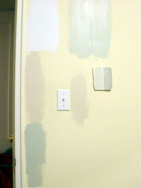
For the bedroom, I settled on one sample, Glidden Polished Limestone.

It was wonderful, though I still am deciding between this and Chocolate Froth. One of the bedroom walls (also three test areas there):

I tried doing this without a flash because it was making it way bright, but it turned out fuzzy. The Polished Limestone sample is to the top right (you can tell it's eggshell v. flat on the others). Quietude is to the left. Chocolate Froth is the one by the light switch.
I surprised myself by not being as color adventurous as I thought I'd be. I gravitated way away from brights. In some ways, choosing a neutral is harder, I think. I guess I'd be more willing to go with something with more saturated color if I owned my place. I just can imagine the look on my landlord's face if he came in and saw red or black walls. Even if I offer to prime over it, I can just imagine. Besides, to really make that work, I'd feel like I needed to really coordinate my furniture and everything. As it is, I think the neutrals will look better and fit more with my decor choices.
Take aways for your next paint picking project:
1.) Use the computer. Though screen resolution can change colors, it helps reduce the sense of being overwhelmed. Or, go to the store (don't buy anything yet), and get a few (and I mean a few–I know how a few can change into 50), bring them home, and then use the web tools offered by the paint companies to find ones slightly darker/cooler/warmer to find the perfect one.
2.) Though Glidden offers those cute nail polish looking samples with an included brush, these cost the same as the little pot of sample which has much more paint. Might as well get that one and use your own brush. If you don't use it to cover a wall, you can always use the paint for another project or if you choose the paint, to store touch up paint (that was Mom's idea).
All in all, I'm excited! This is my first painting project (that my brother will execute! Thanks, bro!) since I lived at my parents. It's VERY exciting! You know you'll see before and afters!


